

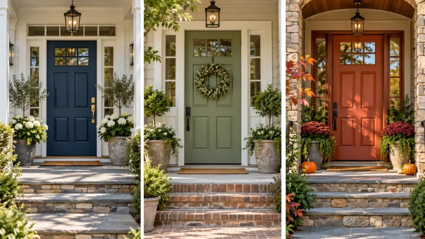
A front door is one of the first things visitors notice when approaching a home. The right color can create a welcoming entrance, complement exterior materials, and improve the overall appearance of your property. From timeless black and white to bold red, blue, and green, there are many beautiful front door colors to suit different architectural styles.
Choosing a front door paint color involves more than selecting a shade that looks attractive on a sample card. Your home’s siding, brickwork, trim, roof, and surrounding landscape all influence how a color appears. Natural lighting and the finish of the paint can also change the way a shade looks throughout the day.
Whether you want a modern front door, a traditional entrance, or a colorful statement, understanding popular color combinations can make the decision easier. This guide explores front door color ideas, design considerations, and practical painting tips to help you create an entrance that suits your home.
Why Does Your Front Door Color Matter?
Your front door color contributes to the overall character of your home’s exterior. It can create a focal point, emphasize architectural details, and establish a welcoming impression. A thoughtfully selected shade helps connect the entrance with surrounding materials while making the exterior design feel more intentional and visually balanced.
Front door colors can also influence how people perceive a property. Dark shades often create a sophisticated appearance, while brighter colors may feel energetic and inviting. Neutral tones generally produce a timeless look that works with various design styles, making them appealing to homeowners who prefer understated exterior decoration.
The best front door color should reflect both your personal preferences and the architectural characteristics of your home. A shade that complements brick, siding, and trim can create a cohesive exterior. Considering the surrounding environment and existing color palette helps ensure that your entrance looks attractive throughout different seasons and lighting conditions.
How to Choose the Best Front Door Color
Choosing the best front door color starts with examining your home’s existing exterior palette. Look at the siding, brick, stone, roof, and trim to identify their dominant colors and undertones. A coordinated color scheme can help the entrance stand out naturally without creating an overwhelming or disconnected appearance.
Next, consider the architectural style of your property. Traditional homes often pair beautifully with classic shades such as navy blue, forest green, black, or burgundy. Modern homes may look striking with charcoal, matte black, muted sage, or warm wood-inspired tones that emphasize clean lines and contemporary materials.
Finally, test several paint samples directly on the door or on movable sample boards. Observe each color in morning light, afternoon sunlight, and evening shade before making a final decision. Exterior lighting can significantly influence color appearance, so testing helps prevent disappointment after completing the painting project.
Classic Black Front Door Ideas
Black is one of the most versatile front door colors because it complements many exterior materials and architectural styles. It creates strong contrast against white siding, light brick, and pale stucco surfaces. The result is often a clean, sophisticated entrance that feels balanced without requiring additional decorative colors.
A black front door works particularly well with modern farmhouse homes, colonial properties, and contemporary architecture. Pairing black paint with white trim produces a timeless combination, while warm brass hardware can introduce subtle elegance. Matte finishes create a softer appearance, whereas glossy black paint emphasizes the door’s shape and decorative details.
When choosing black paint, consider how direct sunlight affects the door surface. Dark colors can absorb more heat, which may be important for certain door materials and exterior conditions. Selecting an appropriate exterior paint and following manufacturer recommendations helps maintain the finish while supporting long-term durability.
Elegant White Front Door Colors
White front doors create a bright, clean appearance that suits many residential designs. They can make an entrance feel open and welcoming while complementing darker exterior colors. White is especially effective when paired with navy siding, charcoal exteriors, red brick, or homes featuring strong architectural contrast.
There are several white shades to consider, including pure white, ivory, cream, and soft off-white. Bright white provides a crisp contemporary appearance, while warmer whites feel more traditional and relaxed. Choosing a white that matches the undertones of surrounding trim and siding can create a more cohesive exterior design.
White doors may require more frequent cleaning because dirt, fingerprints, and outdoor marks can become visible. A durable exterior finish can make routine maintenance easier. Homeowners should also evaluate the amount of shade around the entrance, since certain white tones can look cooler or warmer depending on nearby surfaces.
Bold Red Front Door Ideas
Red is a classic choice for homeowners who want their entrance to stand out. It creates a strong visual focal point and can make a neutral exterior feel more energetic. Red front doors are commonly associated with welcoming entrances and traditional architecture, although the color also works with selected contemporary designs.
Different red shades create different impressions. Bright cherry red adds a lively appearance, while deep burgundy and brick red provide a more refined look. Homes with white siding, gray exteriors, or certain natural brick finishes can pair beautifully with red when the undertones are carefully coordinated.
A red front door often works best when surrounding exterior colors remain relatively simple. Neutral trim and understated hardware allow the door to attract attention without competing with nearby design elements. Testing red samples outdoors is especially important because strong sunlight can make certain shades appear brighter than expected.
Navy Blue Front Door Colors
Navy blue is a popular front door color because it combines richness with a timeless appearance. It offers a softer alternative to black while maintaining a sophisticated visual effect. Navy doors can complement white siding, light gray exteriors, natural stone, and various traditional architectural styles.
Deep navy creates an elegant entrance when paired with crisp white trim and polished metal hardware. Brushed brass can introduce warmth, while silver or black hardware produces a more understated appearance. This flexibility makes navy blue suitable for coastal homes, colonial properties, and modern residential designs.
When selecting navy paint, pay attention to its undertones. Some navy shades lean toward purple, while others contain hints of green or gray. Comparing samples against your home’s existing materials helps ensure that the chosen shade looks intentional rather than unexpectedly mismatched.
Light Blue Front Door Ideas
Light blue front doors create a fresh and relaxed appearance that works particularly well with coastal and cottage-style homes. Soft blue shades can make an entrance feel welcoming without producing the strong contrast associated with darker colors. They also pair naturally with white siding and neutral exterior materials.
Popular options include powder blue, sky blue, dusty blue, and muted blue-gray. Powder blue produces a cheerful appearance, while gray-blue offers a more subtle and contemporary look. These shades can complement pale stone, cream siding, and weathered wood when the surrounding colors share compatible undertones.
Light blue may appear significantly different in direct sunlight compared with shaded conditions. Some shades become brighter outdoors, while muted blues can look almost gray during cloudy weather. Testing the color on the actual door helps determine whether it suits your preferred exterior appearance.
Sage Green Front Door Colors
Sage green is an attractive choice for homeowners who prefer soft, nature-inspired colors. Its muted green appearance creates a calm and understated entrance while complementing many neutral exterior palettes. Sage works especially well with cream siding, warm white trim, natural wood, and light stone surfaces.
This color is commonly used in farmhouse, cottage, and contemporary exterior designs. A sage green front door can introduce color without feeling overly bright or dramatic. Pairing it with black hardware creates a modern contrast, while warm metallic finishes can produce a softer traditional appearance.
Different sage shades contain varying amounts of gray, yellow, or blue. These undertones influence how the color interacts with brickwork and surrounding landscaping. Homeowners should compare samples in natural light to find a shade that feels balanced with both the house and its outdoor setting.
Forest Green Front Door Ideas
Forest green is a rich, traditional front door color that creates a confident and elegant entrance. Its deep tone works well with brick houses, cream exteriors, and natural stone. The color offers a classic appearance while providing an alternative to familiar black or navy blue doors.
A forest green front door can complement homes surrounded by mature trees, gardens, and natural landscaping. Brass or bronze hardware often enhances its warm, traditional character. For a more contemporary appearance, homeowners can combine dark green paint with simple black fixtures and minimal exterior decoration.
Deep green colors may appear nearly black in shaded conditions, particularly on recessed entrances. Testing the shade at different times of day helps preserve the desired green appearance. The right combination of lighting, trim, and hardware can create a welcoming entrance with lasting visual appeal.
Olive Green Front Door Colors
Olive green offers a warm, earthy alternative to brighter green front door colors. Its yellow and brown undertones create a natural appearance that pairs beautifully with beige siding, cream stucco, and warm-toned brick. This makes olive a versatile choice for homes featuring organic materials and understated exterior palettes.
An olive green door works well with Mediterranean, rustic, and contemporary architectural styles. It can introduce a subtle contrast against light exterior walls without overwhelming the surrounding design. Wooden accents, bronze hardware, and natural stone details often complement the warmth of this color.
Olive green varies from muted gray-green to deeper, golden-green shades. Choosing the correct undertone is important when matching exterior brickwork or painted siding. A sample that appears balanced indoors may look noticeably different outside, so observe several options before committing to the final shade.
Cheerful Yellow Front Door Ideas
Yellow front doors create a bright and welcoming focal point that can bring personality to an otherwise neutral exterior. This color works particularly well with white, gray, navy, and charcoal siding. Depending on the chosen shade, yellow can create either a playful entrance or a warm, sophisticated appearance.
Soft buttery yellow offers a gentle cottage-inspired look, while mustard yellow provides a deeper and more contemporary effect. Bright golden yellow can make a strong statement against dark exterior walls. The best choice depends on the amount of contrast you want and the architectural details surrounding the entrance.
Yellow paint often appears more intense in direct sunlight, so choosing a shade requires careful testing. Warm neutrals and simple hardware can help balance the finished appearance. Homeowners who prefer a subtle design may find muted mustard or pale yellow easier to coordinate than highly saturated shades.
Warm Orange and Terracotta Front Door Colors
Orange and terracotta front doors bring warmth and personality to residential exteriors. These colors are inspired by natural clay, autumn landscapes, and earthy design palettes. They work especially well with cream stucco, beige siding, natural stone, and certain contemporary architectural finishes.
Terracotta is generally more muted than bright orange, making it easier to coordinate with traditional exterior materials. Burnt orange creates a stronger visual statement while maintaining earthy warmth. Both options can complement black hardware, warm wood accents, and landscaping that features natural textures.
When selecting these colors, consider the undertones of nearby brick and roofing materials. Similar warm shades can create harmony, but excessive matching may cause the entrance to lose definition. A small amount of contrast around the trim can help the door remain visible and visually balanced.
Soft Pink Front Door Ideas
Pink front doors can create a distinctive entrance without necessarily appearing overly bright. Soft blush, dusty rose, and muted pink shades provide gentle color that complements neutral exteriors. These tones are especially attractive on cottage-style homes, light stucco houses, and properties with simple architectural details.
Blush pink pairs naturally with warm white, beige, and certain gray exterior finishes. Dusty rose offers a more subdued appearance because of its gray or brown undertones. Homeowners seeking a contemporary style may combine muted pink paint with black hardware and minimal decorative elements.
Pink shades can change noticeably under different lighting conditions, sometimes appearing peach or lavender depending on their undertones. Testing samples against the exterior walls helps identify the most suitable option. A carefully chosen pink door can create a welcoming focal point while maintaining a balanced overall design.
Purple and Lavender Front Door Colors
Purple front doors provide an unusual way to introduce personality into a home’s exterior design. Deep plum creates a rich and elegant appearance, while lavender and muted violet offer softer alternatives. These shades can complement certain gray, white, cream, and natural stone exteriors when carefully coordinated.
A deep purple door may work well on traditional homes that already feature darker trim or decorative details. Lavender can create a relaxed cottage-inspired entrance, particularly when paired with pale siding and simple hardware. Muted purple-gray shades provide a contemporary option for homeowners who prefer understated color.
Purple paint can be challenging to coordinate because undertones strongly influence its appearance. Some shades lean toward blue, while others contain noticeable red or gray. Testing the color outdoors and comparing it with surrounding materials can help prevent unwanted contrast or an inconsistent exterior palette.
Charcoal Gray Front Door Ideas
Charcoal gray creates a modern, sophisticated entrance without the intensity of pure black. It pairs well with white siding, natural stone, warm brick, and many contemporary exterior finishes. Its neutral character makes it suitable for homeowners who prefer a clean design with subtle visual contrast.
A charcoal front door can be combined with black hardware for a coordinated modern appearance. Brushed nickel or stainless steel fixtures may create a cooler architectural look. Warmer metallic hardware can also work when surrounding materials include wood, beige stone, or other earthy tones.
Different charcoal paints contain blue, green, or brown undertones that affect the finished appearance. A cooler charcoal may complement blue-gray siding, while a warmer version can coordinate better with beige or brown brick. Comparing samples outdoors helps homeowners choose a shade that enhances the existing exterior.
Beige and Greige Front Door Colors
Beige and greige front doors provide a soft, neutral appearance that can complement many exterior styles. Greige combines gray and beige undertones, creating a balanced color that works with both warm and cool surroundings. These shades are suitable for homeowners who prefer understated entrances rather than strong color contrasts.
Warm beige doors can look attractive against dark siding, charcoal trim, and natural brick. Greige is particularly versatile because it can coordinate with modern farmhouse and transitional architectural designs. Pairing these colors with black hardware creates definition, while bronze finishes can emphasize a warmer appearance.
The main challenge with neutral front door colors is ensuring that the door remains visually distinct from surrounding walls. If the door and siding are too similar, the entrance may lack definition. Contrasting trim, attractive hardware, or subtle differences in color depth can help create a more intentional design.
Natural Wood-Inspired Front Door Colors
Natural wood tones create a warm and timeless entrance that complements many home exteriors. Shades inspired by oak, walnut, cedar, and teak can add texture and character. These colors are particularly attractive when a home’s design includes exposed beams, stone accents, or other natural materials.
A genuine wood front door can display visible grain patterns that give the entrance a distinctive appearance. Alternatively, certain paint and finishing products can create wood-inspired colors on suitable surfaces. The final effect depends on the door material, finish quality, and whether the design aims to preserve or imitate natural grain.
Wood-inspired finishes work well with black, white, charcoal, and cream exteriors. However, exterior wood surfaces often require periodic maintenance to protect against moisture and sunlight. Choosing products designed for outdoor exposure can help preserve the door’s appearance while reducing premature deterioration.
Best Front Door Colors for White Houses
White houses provide a flexible background for many front door colors because their neutral exterior allows strong or subtle contrasts. Black, navy blue, forest green, and red are particularly popular options. These shades create noticeable focal points while maintaining a balanced relationship with white siding and trim.
Homeowners seeking a softer appearance can consider sage green, dusty blue, pale yellow, or natural wood tones. These colors introduce personality without producing an overly dramatic entrance. The ideal choice depends on the home’s architectural style, landscaping, roof color, and surrounding decorative materials.
White houses may have warm or cool undertones, especially when the siding is cream or off-white rather than pure white. This difference can affect the appearance of nearby paint colors. Comparing door samples with the actual siding helps ensure that the selected shade creates an attractive and intentional combination.
Best Front Door Colors for Gray Houses
Gray exteriors can complement a wide variety of front door colors because they often provide a neutral background. Navy blue, black, white, and deep green create classic combinations. Brighter colors such as red, mustard yellow, and orange can introduce stronger contrast for homeowners who prefer a more expressive entrance.
The undertone of gray siding influences which colors look most balanced. Cool blue-gray walls may coordinate naturally with navy or crisp white, while warmer greige exteriors often work well with olive green, terracotta, or natural wood shades. Recognizing these differences helps prevent color combinations that feel unintentionally mismatched.
Trim and roofing materials should also influence the final decision. A charcoal-gray home with black trim may benefit from a lighter door that remains visible. A pale gray house can support darker or brighter colors, allowing the entrance to become the main visual feature.
Best Front Door Colors for Brick Houses
Brick houses require careful color selection because natural brick contains several tones and textures. Red brick may include brown, orange, purple, or gray undertones that influence nearby paint colors. Coordinating the front door with these existing shades helps create a balanced exterior without competing with the brickwork.
Black, navy blue, forest green, and deep burgundy are popular choices for traditional red brick homes. Cream and warm white can also provide attractive contrast. Homeowners who prefer a softer contemporary appearance may consider muted sage or charcoal, depending on the brick’s underlying color.
Brown and tan brick houses often pair well with dark green, black, warm white, or natural wood tones. Avoid selecting a color based only on general recommendations for brick exteriors. Examining the actual brick in natural light helps identify combinations that complement its unique variation.
Best Front Door Colors for Beige Houses
Beige homes often look attractive with front door colors that provide warmth or noticeable contrast. Deep navy, charcoal, forest green, and black can create a sophisticated entrance. These darker shades help define the doorway while complementing the soft, neutral appearance of beige siding or stucco.
Earthy colors such as terracotta, olive green, and warm wood tones are also suitable options. They create a coordinated appearance by building on the warm undertones commonly found in beige exteriors. Homeowners wanting a brighter statement may consider muted red or mustard yellow when the surrounding design remains relatively simple.
Beige can contain yellow, pink, or gray undertones that influence color coordination. Testing several shades against the siding can help identify the best match. Door hardware, exterior lighting, and nearby landscaping should also be considered when developing a cohesive entrance design.
Modern Front Door Colors for Contemporary Homes
Modern homes often feature clean architectural lines, simple materials, and restrained color palettes. Front door colors such as matte black, charcoal gray, deep navy, and muted green can complement this design approach. These shades create visual interest without overwhelming the building’s architectural features.
Contemporary homes can also support bold statement colors when the surrounding exterior is relatively neutral. Mustard yellow, burnt orange, and rich blue may work beautifully with white, concrete, or dark siding. The contrast helps emphasize the entrance and introduces personality into an otherwise minimal design.
Finish selection is particularly important in modern architecture. Matte and satin surfaces often create a refined appearance, while glossy finishes produce stronger reflections. Choosing simple hardware and coordinating the door with nearby architectural elements helps maintain the clean aesthetic associated with contemporary homes.
Traditional Front Door Color Ideas
Traditional homes often look best with colors that complement established architectural details. Classic black, navy blue, burgundy, and forest green remain popular because they create a timeless appearance. These shades can enhance decorative trim, paneled doors, and symmetrical entrances commonly found in traditional residential designs.
A deep red front door can add warmth to a colonial-style home, while navy may create a formal and elegant appearance. Dark green often works well with brickwork and natural stone. White and cream doors can also suit traditional properties when paired with contrasting shutters or decorative hardware.
Traditional design does not require limiting the entrance to dark colors. Muted blue, sage green, and selected neutral shades can create a welcoming appearance while preserving architectural character. The key is choosing a color that complements existing materials and maintains visual harmony across the home’s exterior.
Farmhouse and Cottage Front Door Colors
Farmhouse and cottage homes often emphasize natural materials, comfortable details, and welcoming color palettes. Sage green, dusty blue, soft white, and muted black are popular choices. These colors complement wood siding, traditional porch features, and decorative elements commonly associated with relaxed residential styles.
For modern farmhouse homes, black front doors create a striking contrast against white siding and simple trim. A natural wood finish can introduce additional warmth, especially when the exterior includes black windows or exposed wooden accents. Muted green and blue provide softer alternatives that maintain a traditional appearance.
Cottage entrances can support more playful color choices, including pale yellow, lavender, and dusty rose. These shades often work beautifully with garden landscaping and light-colored exteriors. Keeping hardware and surrounding decoration coordinated helps maintain charm without creating an excessively busy appearance.
Should You Choose a Matte, Satin, or Glossy Finish?
Paint finish influences both the appearance and maintenance requirements of a front door. Matte finishes provide a soft, understated look with limited reflection. However, some matte exterior products may show marks or require more careful cleaning, depending on their formulation and the door’s exposure conditions.
Satin and semi-gloss finishes are popular because they offer a balance between appearance and practical cleaning. Satin provides gentle reflection, while semi-gloss creates a more noticeable shine that can highlight architectural details. Glossy finishes produce a bold appearance but may reveal surface imperfections more clearly.
The best finish depends on door material, paint compatibility, personal preference, and environmental exposure. Exterior products should be selected according to manufacturer recommendations rather than appearance alone. Testing a small sample can help determine whether the finish produces the desired effect under natural outdoor lighting.
How to Paint a Front Door the Right Way
Painting a front door begins with preparing the surface properly. Clean away dirt, grease, and loose material before examining the existing finish for damage. Depending on the door material and paint condition, light sanding and a compatible primer may be necessary to create a suitable surface for the new coating.
Choose an exterior-grade paint designed for the specific door material, whether wood, fiberglass, or metal. Apply the product according to the manufacturer’s instructions, paying attention to temperature, drying conditions, and recommended coat thickness. Appropriate preparation and application help support an even finish and long-term performance.
Allow each coat to dry as directed before applying additional paint or closing the door against weatherstripping. Rushing the process can create sticking, uneven coverage, or visible marks. Using suitable brushes or rollers and working carefully around panels and edges can produce a smoother finished appearance.
Common Front Door Color Mistakes to Avoid
One common mistake is selecting a front door color without considering the rest of the exterior. A shade may look attractive on its own but clash with nearby brick, siding, or roof materials. Comparing samples against the actual house helps prevent unexpected color combinations.
Another mistake involves choosing a paint color based only on indoor lighting or digital photographs. Outdoor sunlight can make colors appear brighter, cooler, or more saturated. Testing samples in several lighting conditions provides a more reliable impression of the finished entrance.
Ignoring paint quality and surface preparation can also cause problems. Even a beautiful color may look disappointing when applied over damaged or poorly prepared surfaces. Selecting suitable exterior products and following recommended application instructions helps protect the finish and maintain the door’s appearance over time.
How Front Door Colors Improve Curb Appeal
Curb appeal refers to the overall visual impression a property creates when viewed from the street. The front door contributes to this impression because it naturally draws attention toward the entrance. A coordinated color can emphasize architectural details and make the home appear more welcoming.
Contrasting door colors can help define the entrance against surrounding walls. For example, a navy door on a white house or a black door against pale brick can create an attractive focal point. Softer colors may produce a more understated effect while still improving the overall design.
Front door paint is a relatively accessible way to refresh a home’s exterior without undertaking a complete renovation. However, improved curb appeal does not guarantee a specific increase in property value. The best results come from considering the door alongside landscaping, exterior maintenance, lighting, and overall architectural condition.
How Often Should You Repaint Your Front Door?
The lifespan of front door paint depends on product quality, door material, weather exposure, and maintenance. A well-prepared and properly painted exterior door may retain an attractive finish for several years. However, doors exposed to strong sunlight, rain, or frequent physical contact may require attention sooner.
Common signs that repainting may be necessary include fading, peeling, cracking, and noticeable surface damage. Dark colors can sometimes show heat-related wear more readily on certain materials. Regular cleaning and inspection help identify minor problems before they affect larger sections of the finish.
There is no universal repainting schedule that works for every home. Following manufacturer recommendations and monitoring the door’s condition is more reliable than repainting at fixed intervals. Promptly addressing damaged coatings can help maintain appearance and protect susceptible door materials from environmental exposure.
Conclusion
Front door colors provide a simple way to improve a home’s appearance and express personal style. Classic shades such as black, white, navy, and forest green offer timeless appeal, while yellow, red, pink, and terracotta create more distinctive entrances. The best choice depends on the home’s architecture, surrounding materials, and desired visual effect.
Choosing the right color requires careful consideration of siding, brickwork, trim, lighting, and paint finish. Testing samples outdoors helps reveal how colors change throughout the day. Proper surface preparation and suitable exterior paint also contribute to a more attractive and durable result.
Whether you prefer a modern statement or a traditional entrance, a thoughtfully selected front door color can enhance curb appeal and create a welcoming first impression. Focus on combinations that complement your property rather than following trends alone. With appropriate planning and maintenance, your front door can remain an attractive feature of your home’s exterior.
Frequently Asked Questions
1. What Is the Most Popular Front Door Color?
Black, navy blue, white, and dark green are consistently popular front door colors. These shades work with many exterior styles and provide a timeless appearance that complements different architectural materials.
2. What Front Door Color Increases Curb Appeal?
A color that contrasts attractively with the home’s exterior can improve curb appeal. Popular options include black for white houses, navy for gray siding, and forest green for certain brick exteriors.
3. What Is the Best Front Door Color for a White House?
White houses work well with black, navy blue, forest green, and red front doors. Softer choices such as sage green, dusty blue, and natural wood tones can also create attractive entrances.
4. Should My Front Door Match My Shutters?
Your front door does not need to match your shutters exactly. Coordinating colors can create a traditional appearance, while a complementary contrasting shade may add visual interest and emphasize the entrance.
5. Is Dark or Light Paint Better for a Front Door?
Both can work well depending on the home’s design and door material. Dark colors create stronger contrast but may absorb more heat, while lighter shades often provide a softer appearance.